Tables can obfuscate understanding
And we have a follow up question on the Pandas read_html wikipedia James Bond article. Namely, how do we quickly visualize the data.It is true that the table we had in the previous article doesn't help us with easily seeing the trend (it wasn't the purpose). Even trimming this down to just the Bond movie title and box office normalized to 2005 million $ doesn't help us that much, even with the minimum and maximum highlighted:
| Title | Box office.1 | |
|---|---|---|
| 1 | Dr. No | 448.8 |
| 2 | From Russia with Love | 543.8 |
| 3 | Goldfinger | 820.4 |
| 4 | Thunderball | 848.1 |
| 5 | You Only Live Twice | 514.2 |
| 6 | On Her Majesty's Secret Service | 291.5 |
| 7 | Diamonds Are Forever | 442.5 |
| 8 | Live and Let Die | 460.3 |
| 9 | man with !The Man with the Golden Gun | 334.0 |
| 10 | spy who !The Spy Who Loved Me | 533.0 |
| 11 | Moonraker | 535.0 |
| 12 | For Your Eyes Only | 449.4 |
| 13 | Octopussy | 373.8 |
| 14 | view !A View to a Kill | 275.2 |
| 15 | living !The Living Daylights | 313.5 |
| 16 | Licence to Kill | 250.9 |
| 17 | GoldenEye | 518.5 |
| 18 | Tomorrow Never Dies | 463.2 |
| 19 | world !The World Is Not Enough | 439.5 |
| 20 | Die Another Day | 465.4 |
| 21 | Casino Royale | 581.5 |
| 22 | Quantum of Solace | 514.2 |
| 23 | Skyfall | 879.8 |
Same data, only better
The absolute minimum to get pandas to plot a graph in a Jupyter notebook (I'm assuming you have enabled inline graphics by using %matplotlib inline) is to use the dataframe method plot, ie. df.plot(): |
| The result of df.plot() with no other options |
It usually does the right thing, including a readable legend, and picking only the columns that have numbers or dates. We could also have done a bar graph, but in this case would not have been as readable.
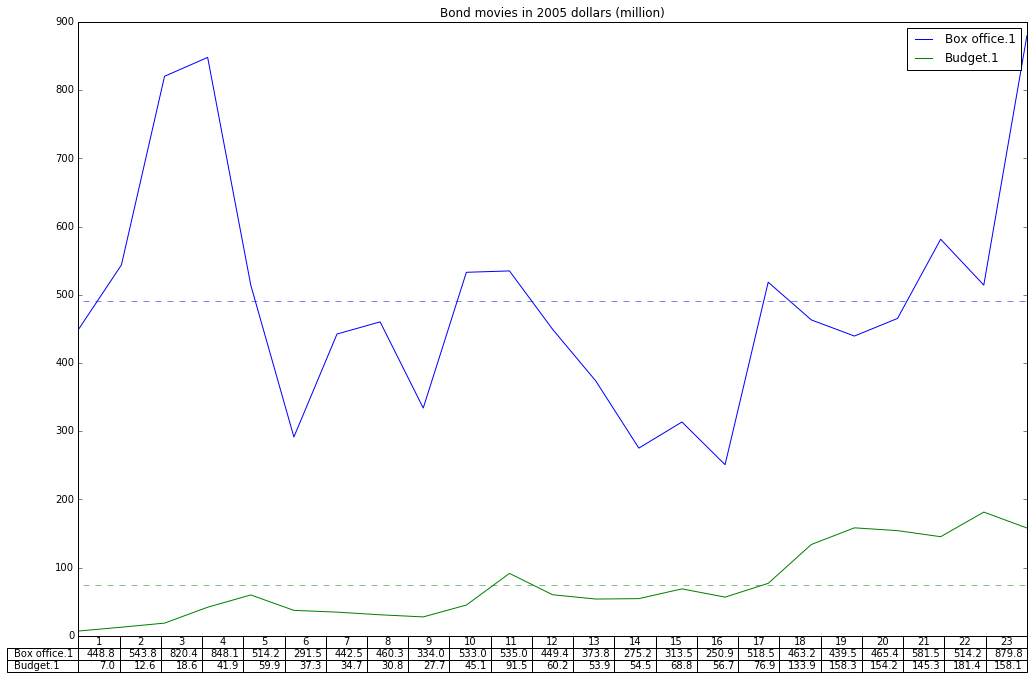
Now, let's add a few elements to this. For one thing, I'd like to not only plot a line graph (default) but to add a table directly under the graph. Since we'll have this table under the X axis, let's remove the tick values on X by using xticks=[].
I think we all can agree that a graph should have a title, so we will add that too. And finally, let's make it a bit larger.
ax = df.plot(table=True, xticks=[], title="Bond movies in 2005 dollars (million)", figsize=(17,11))
And how about adding the average value as a dotted horizontal line for the box office?
ax.hlines(y=df.mean()[0], xmin=0, xmax=23, color='b', alpha=0.5, linestyle='dashed', label='Box office average')
Might as well do it for the budget too. So in all we have:
ax = df.plot(table=True, xticks=[], title="Bond movies in 2005 dollars (million)", figsize=(17,11))
ax.hlines(y=df.mean()[0], xmin=0, xmax=23, color='b', alpha=0.5, linestyle='dashed', label='Box office average')
ax.hlines(y=df.mean()[1], xmin=0, xmax=23, color='g', alpha=0.5, linestyle='dashed', label='Budget average')
So, how does it look? |
| Final result - click to see full size image |
The jupyter notebook can be found on github: pandas_bond.ipynb
Francois Dion
@f_dion
2 comments:
Interesting and informative article.I like the way of writing and presenting.I will share this article.Waiting for new stuff.best essays
This is a great inspiring article. I am pretty much pleased with your good work. You put really very helpful information. Keep it up. Keep blogging. Looking to reading your next post. Custom Essay Writing Service
Post a Comment